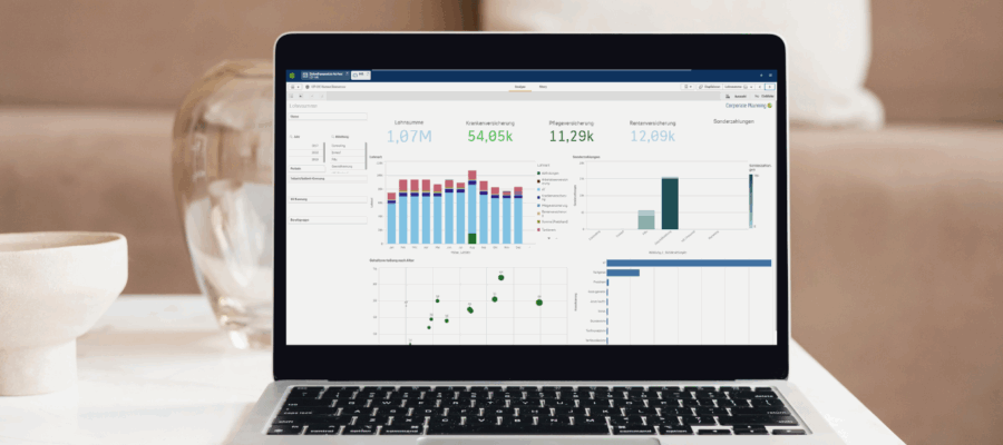
Many companies work with hundreds of key figures, but still do not make better decisions. This is because the measurable is often confused with the important. There are plenty of figures – but which ones provide real insight? And how do you recognize them?
In this webinar, we will talk openly about the function and structure of meaningful KPI systems, about typical errors of reasoning when selecting and presenting them and about why Excel is widely used for KPI work, but is no longer up to date. You will learn how to make clear statements from figures, which key figures have really proven themselves in practice and how to design visualizations in such a way that they make decisions easier – not more difficult.
And of course we show how modern tools such as Qlik can help you to reduce effort and manage faster instead of just reporting.
Your advantages at a glance:
- They understand what function key figures actually fulfill in management and where their limits lie.
- You will learn which key figures are really relevant for corporate management and which can be safely omitted.
- You will learn how key figures can be visualized in an understandable and misleading way.
- You will recognize typical errors in thinking when dealing with key figures and how to avoid them.
- You will see why Excel is not enough in the long term and how modern tools can make things easier.
- You will gain an insight into how we work with Qlik and what you can take away from it for your practice.
Who should take part?
This webinar is aimed at CFOs, managing directors and managers who want to make decisions based on solid figures but do not want to be drowning in data. It is also aimed at controlling managers and controllers who are looking for more structure and meaningfulness in their reports, as well as specialists and project managers who are regularly entrusted with reporting tasks. In short: anyone who works with a lot of figures but wants more clarity, relevance and impact in their management.


